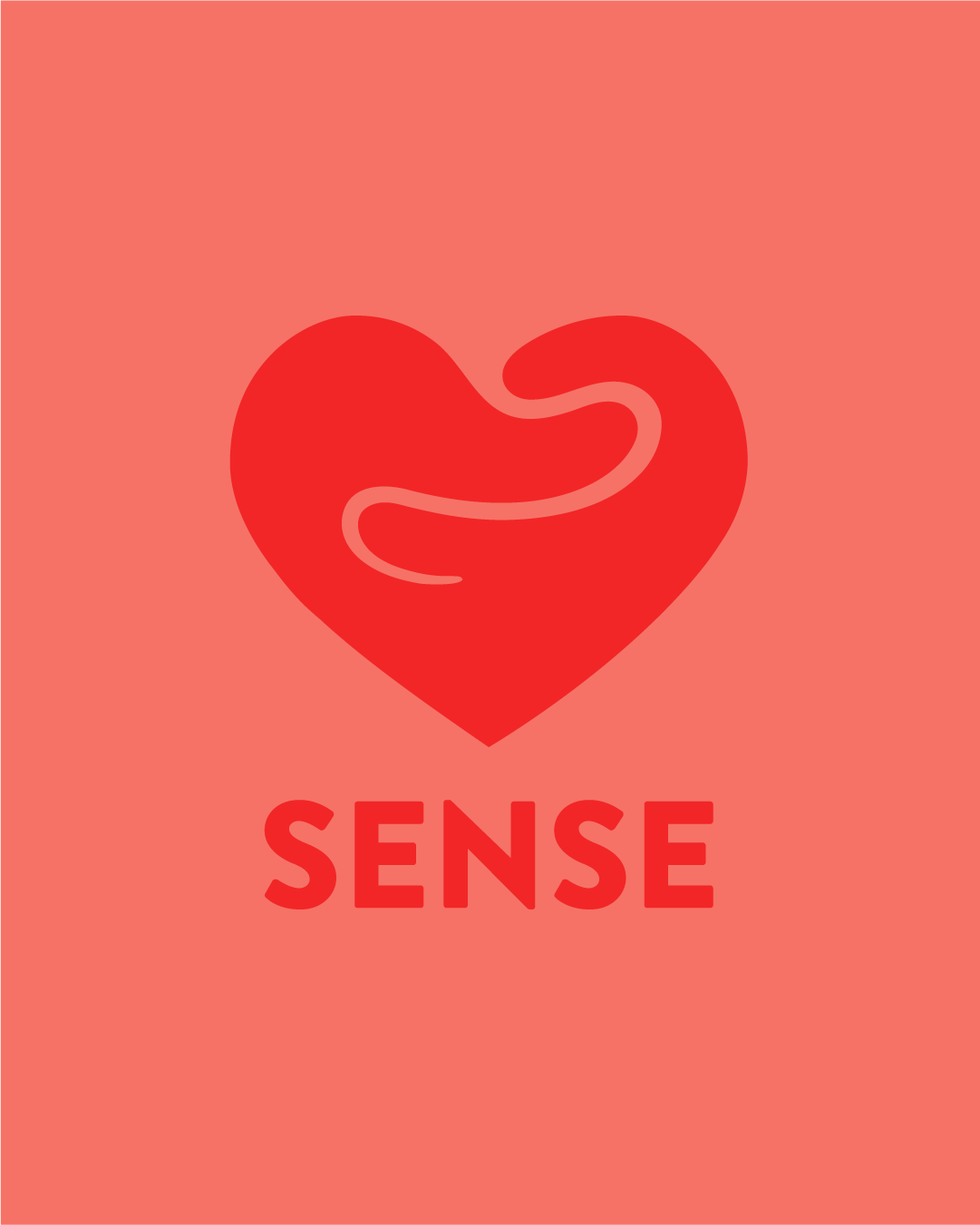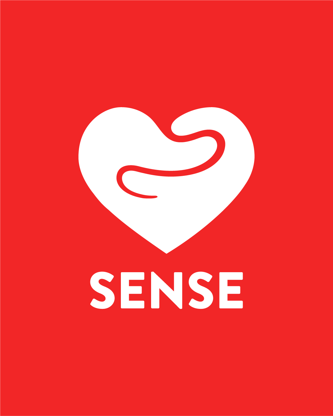

Client: Sense.info
Deliverables: Logo Brand, manual, Logo Animation
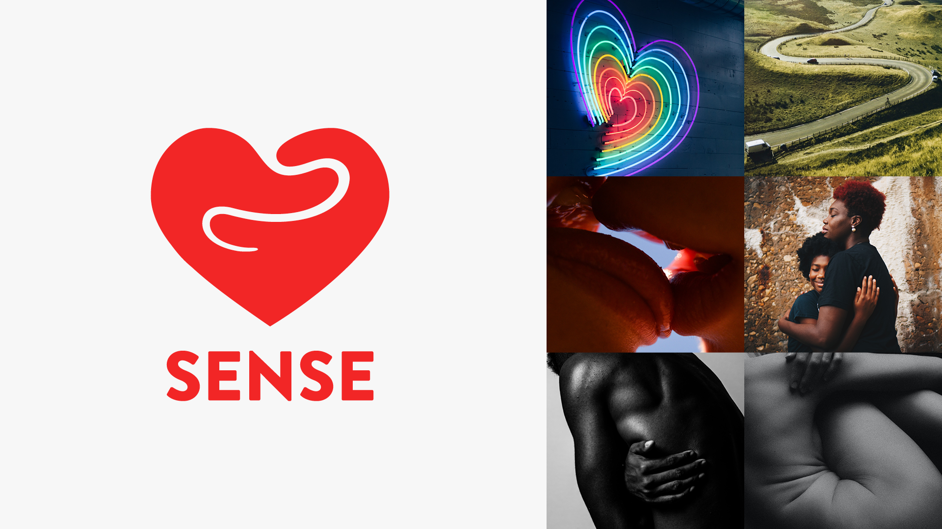
Sense, a Dutch government–funded platform, supports young people with love, sex, sexuality, and safety through chat, phone, video calls, and a comprehensive knowledge base.
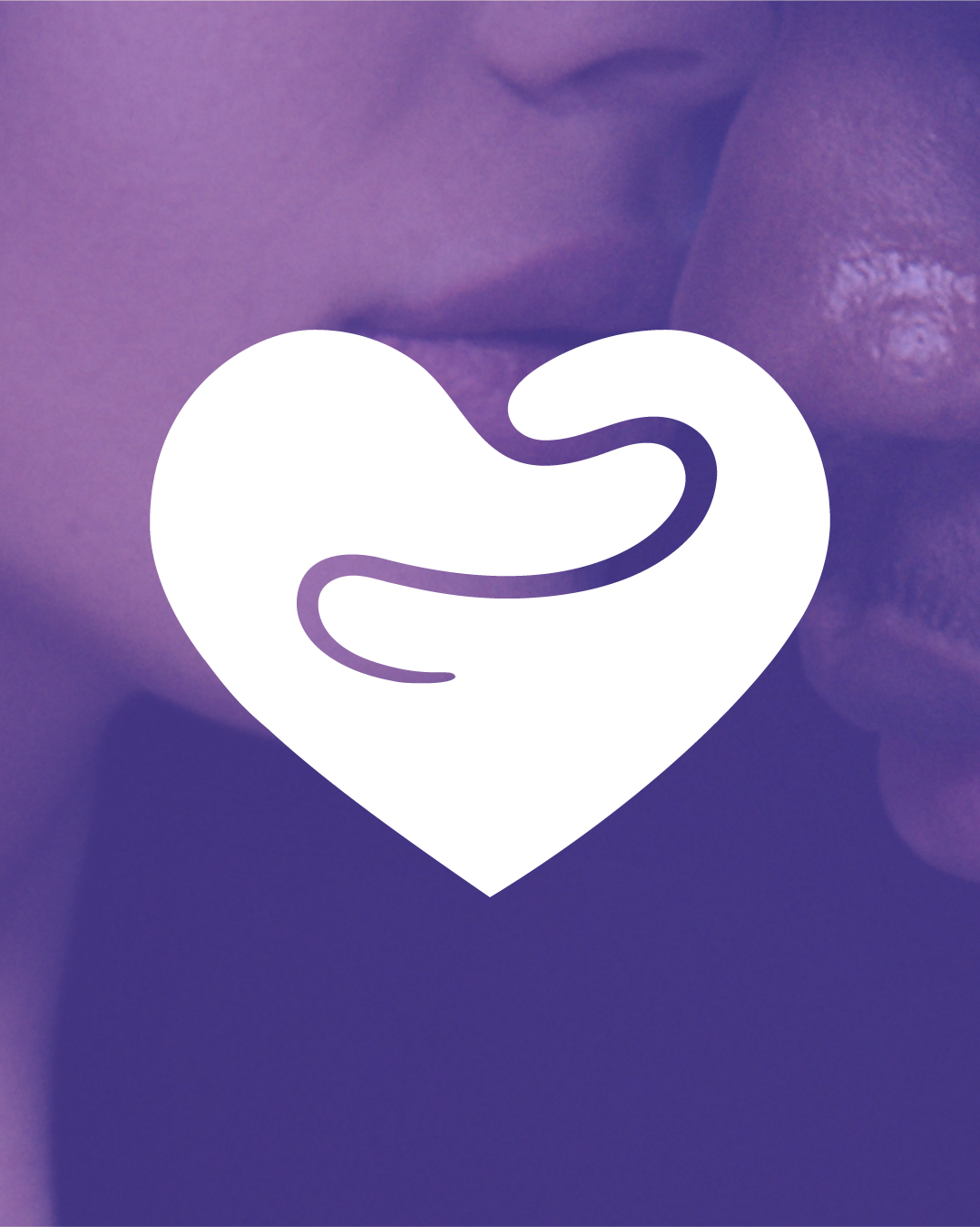
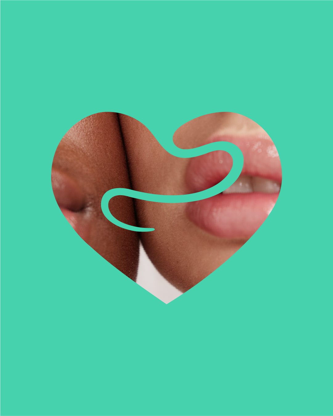
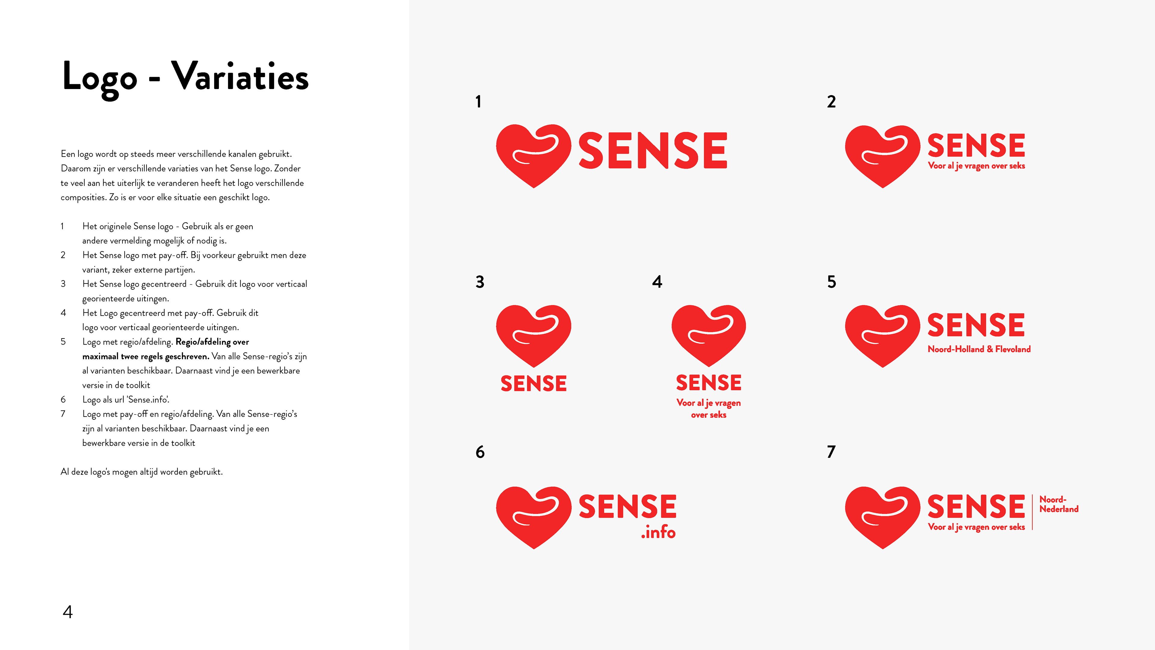
When I was asked to redesign their logo, I wanted to capture both the universality and complexity of love. The heart-shaped logo uses a central cutout to form a twist, representing the journey through love with its surprises and obstacles. The organic shapes echo the curves of human bodies merging, symbolizing intimacy — hugging, caressing, kissing — as well as the guiding touch Sense provides to help young people navigate these experiences safely. Throughout the process, I explored how visual storytelling could make an essential, sensitive topic approachable, meaningful, and memorable for every Dutch teen who encounters the brand.