Client: Moveshelf
Deliverables: Logo, Brand identity, Logo animation
Data is the new currency of the century. With data, we are able to analyze, explain and predict human behavior. Currently, athletes are trained by experience with limited aids of digital opportunities available. Moveshelf strives to understand and distribute human movement by digitizing and organizing information of different body types and their movements into bits and bytes. With their digital library, they will be able to provide powerful, modern and immersive tools to athletes and coaches as well as to 3D animators. While the focus is on animation and movement science now, imagine the future possibilities in rehabilitation processes and posture improvements. With Moveshelf, we are one step closer to creating a healthier world.

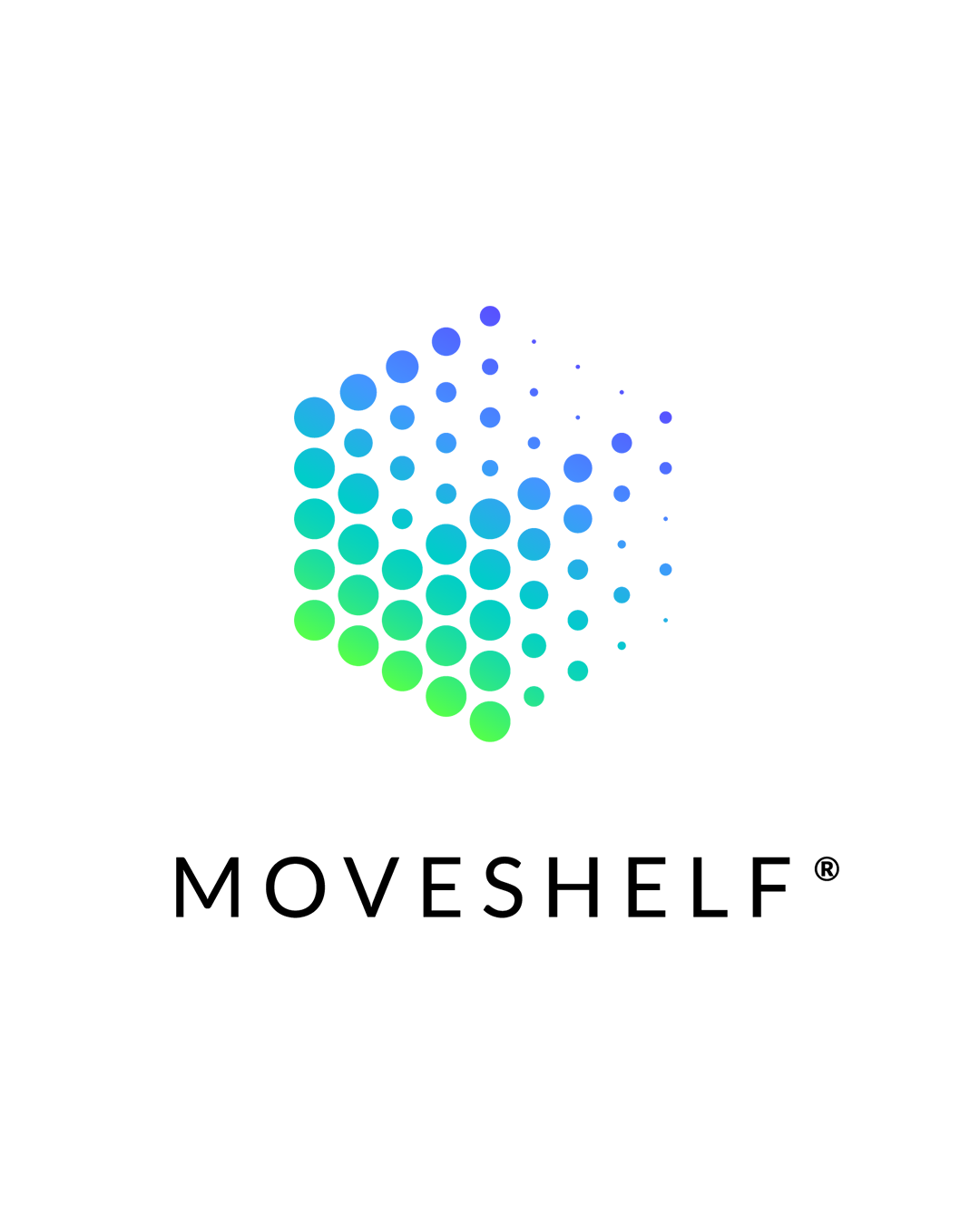
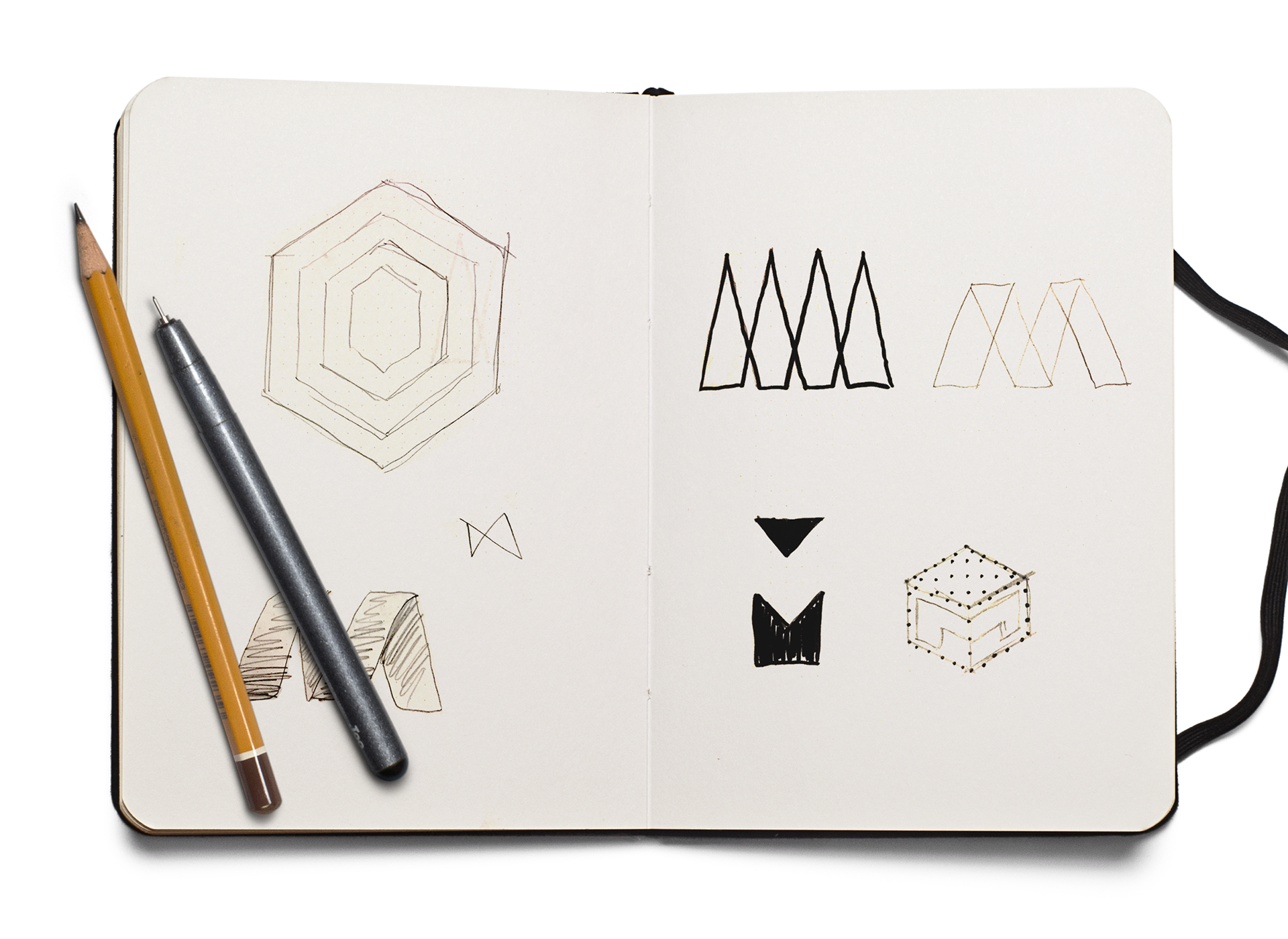
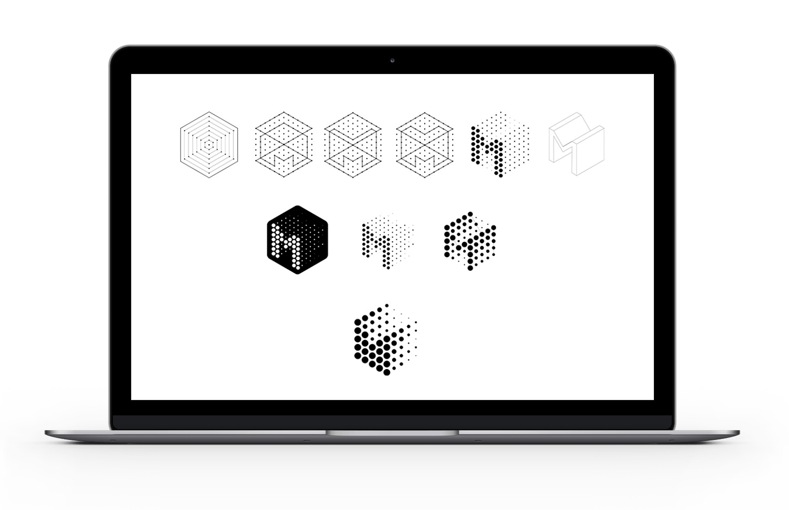
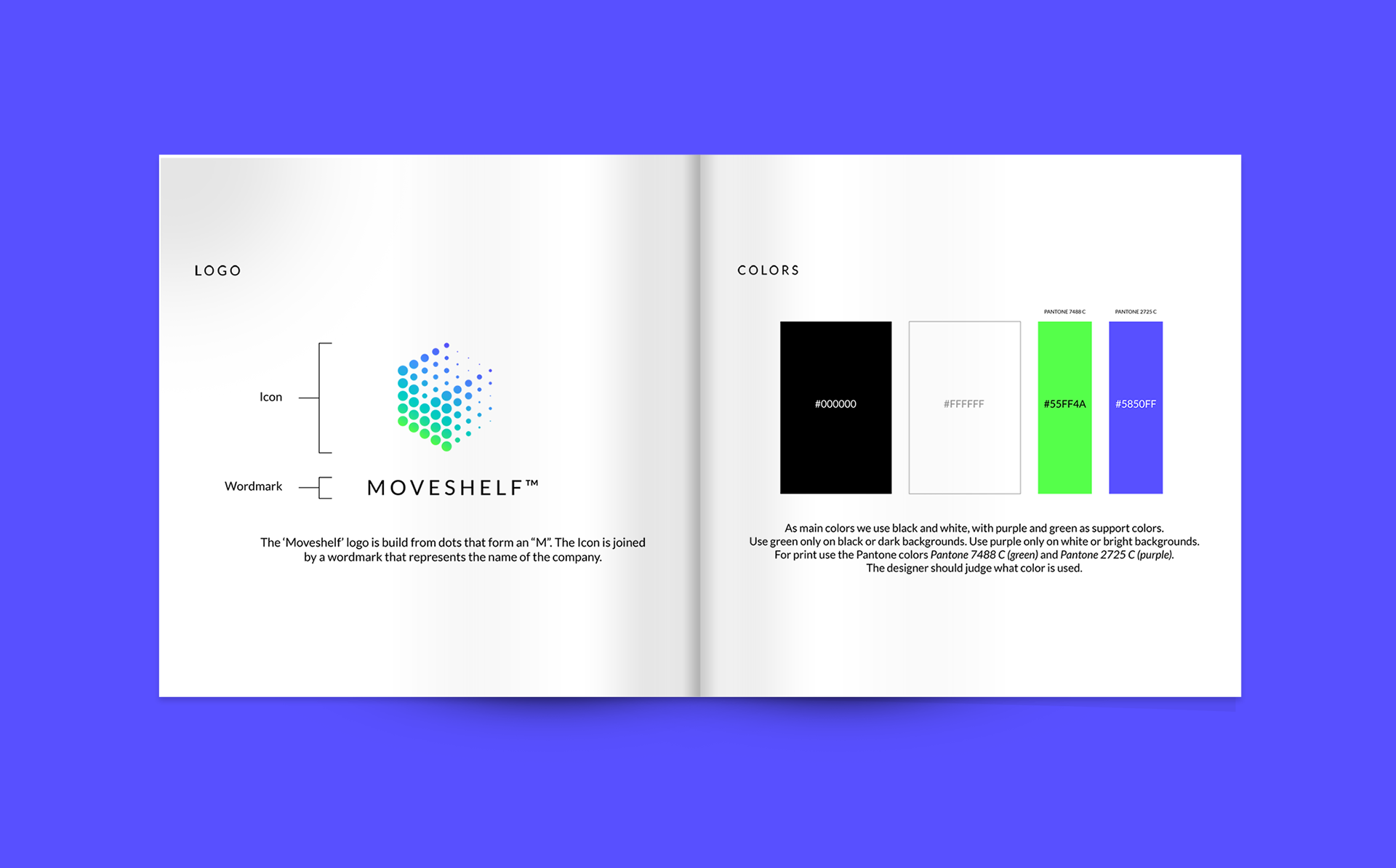
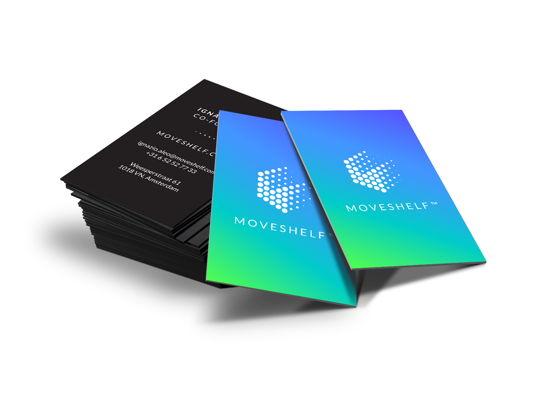
Movement stems from nature. Inspired by this, we gave the branding natural colors of blue and green. However, the brightness of these colors gives it a modern twist referring to innovation. The basis of the logo consists of the letter M for Movement. By putting trails in the logo, the depth emphasizes the movement and data. The hexagon points to one of the most common shapes in nature. With all these different angles and stories, this might be the best logo I ever made.