Client: Hunkering Open Air
Deliverables: Social Media Creatives, Posters, Flyers
Agency: WeDigital
During the summer of 2019, I had the opportunity to collaborate with the WeDigital. We were entrusted with creating a comprehensive campaign for a boat festival. They would infuse their marketing expertise and I brought my design magic to the table. The initial step involved crafting the festival's logo, laying the foundation for the entire project. It was during this project that I delved into Cinema 4D for the first time, and the creative process truly came to life.
I combined 3D elements with some textures to give a euphoric yet industrial look. The same feeling you get when you're standing on a boat while dancing to your favourite rockband. This experience marked a pivotal moment in my journey, demonstrating not only my adaptability but also my ability to bring creativity and innovation to diverse aspects of the branding and promotional process.
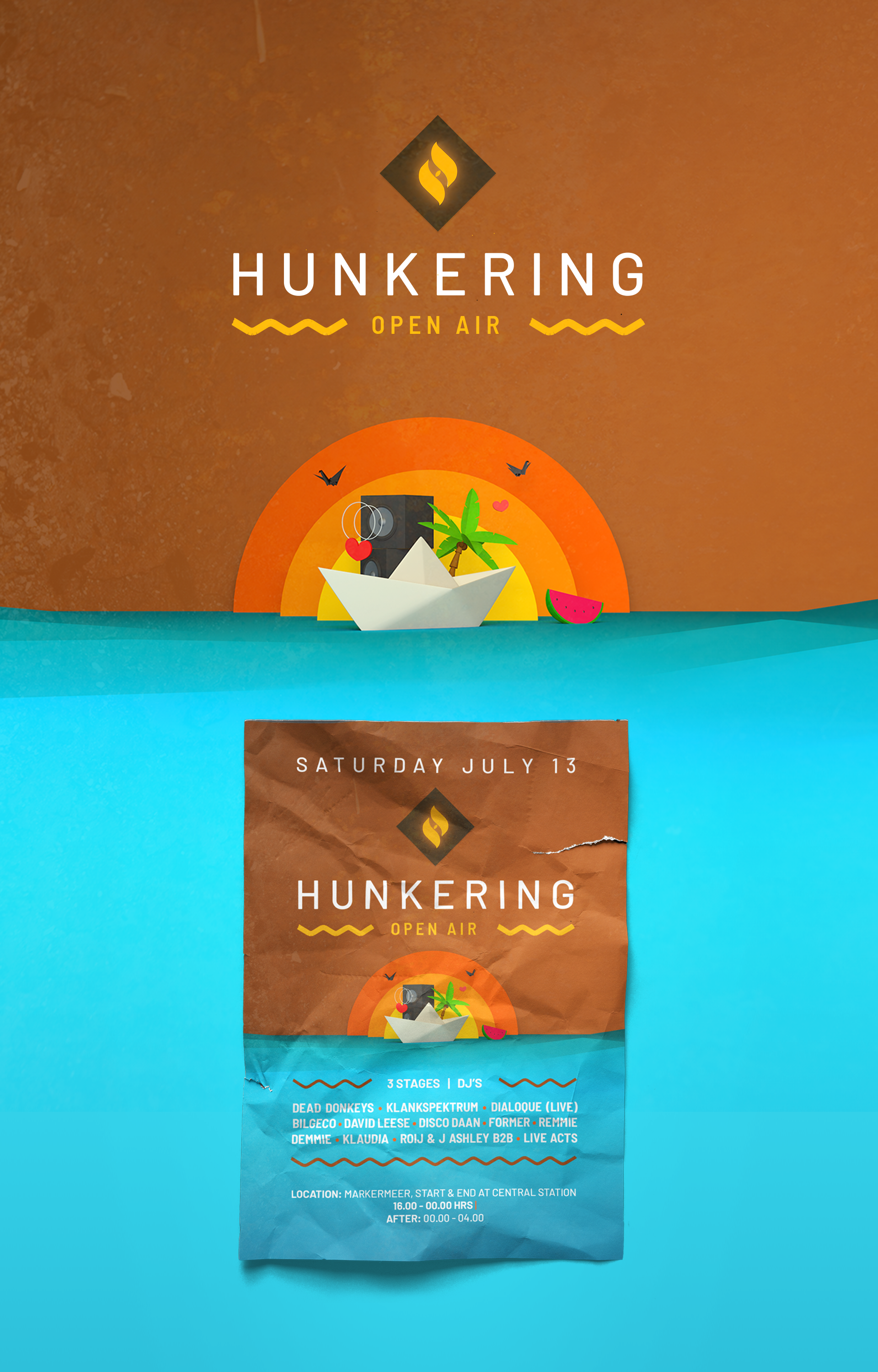
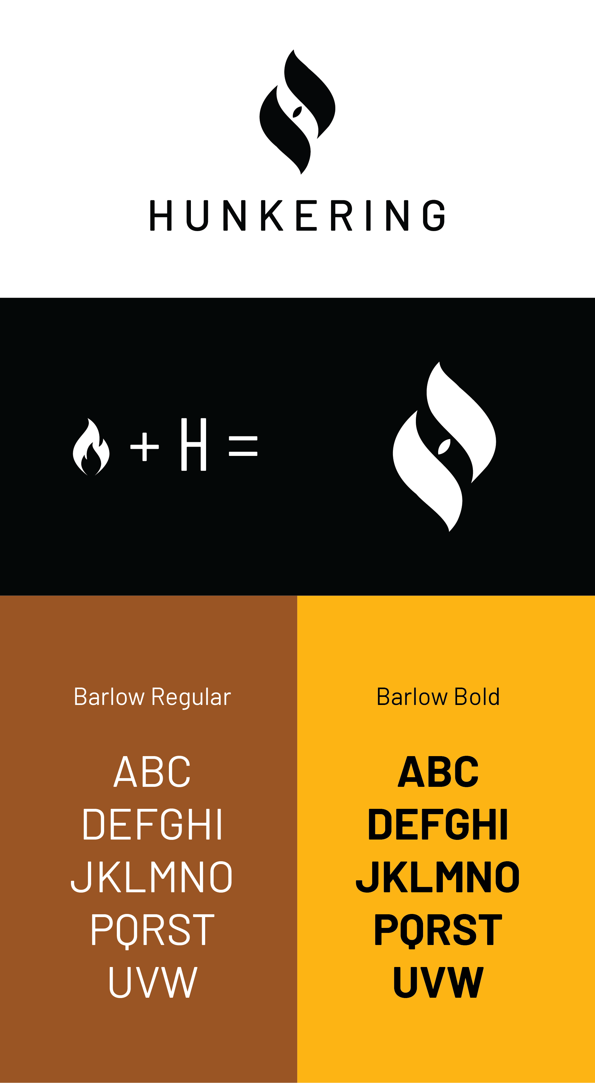
Hunkering means desire in Dutch. The target audience longs for the party and freedom and that's what Hunkering stands for. I translated this desire into fire.The Hunkering logo is based on a flame that also makes a subtle H.
The font for this brand is Barlow. A industrial typeface with some subtle rounded details.
The font for this brand is Barlow. A industrial typeface with some subtle rounded details.