Client: Four Bent Corners
Deliverables: Logo, Brand Identity, Brand manual, Sizzle Reel
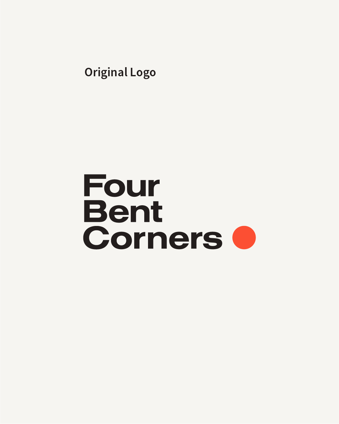
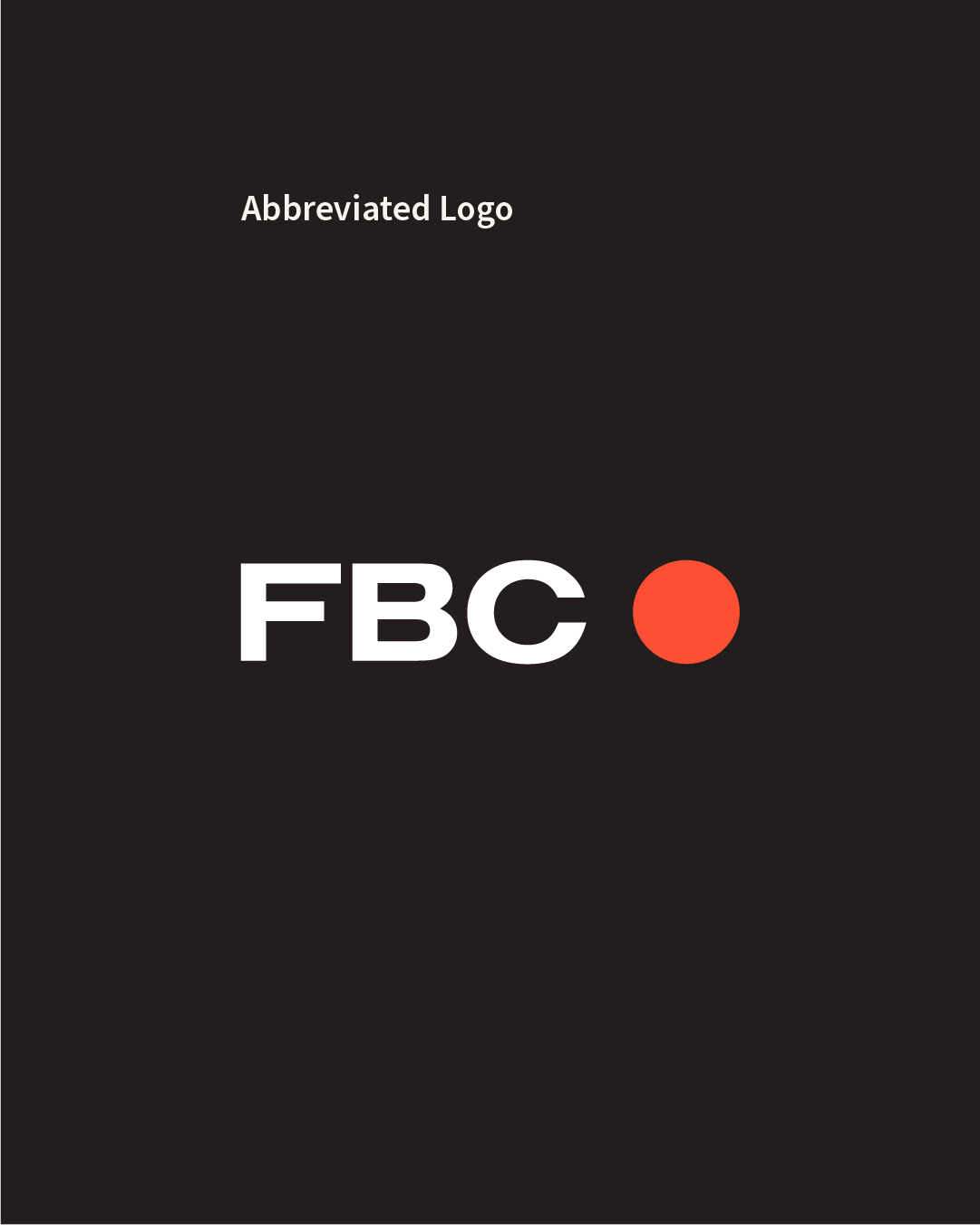
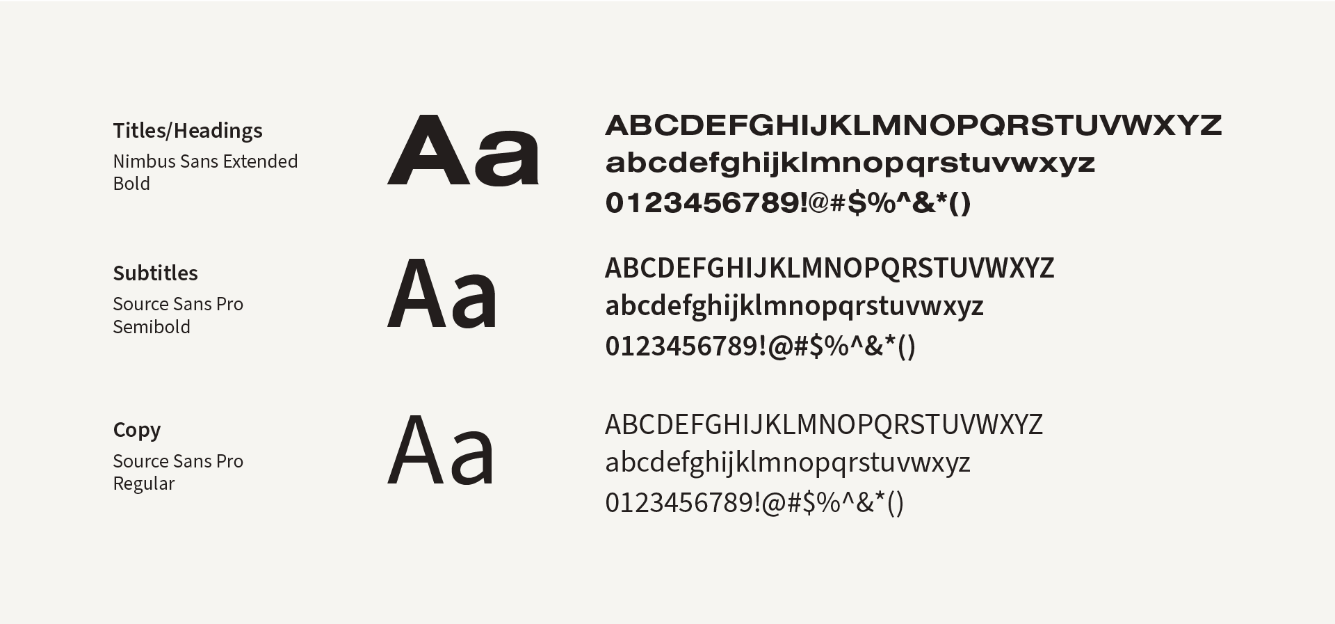
Four Bent Corners is a filmstudio ran By Richard Patterson and Sarina Dimento. Two cool and bright people from the Big Apple, located in Amsterdam (where I met them). After years of designing for them I had the honour of taking on their new brand identity. Including an energetic typography reel displaying all their services.
Scroll down to see a bit of the proces, the result, and the motion reel.
Logo Breakdown
The company name "Four Bent Corners" is already super descriptive. Bold, Simple and recognisable with a 90s VHS aesthetic. Those are at the words that describe this logo. The name is written in a modified version of typeface Nimbus Sans Extended. If you bent four corners to a maximum you automatically get a perfect circle. This is what the dot stands for. Make it red and you have the classic 'recording' dot.
The name 'Four Bent Corners' also stands for the four corners in every corner of the viewfinder.
To take it even farther, you can abbreviate the name by writing it like 'FBC' with a red dot behind it. Now if you squint your eyes it looks like the little 'REC•' logo you see when you're recording something.
Colors & Typography
The colors and fonts match the narrative of "Simple and recognisable, with a 90s VHS aesthetic." The typography is clear, bold, and stylish, forming the foundation of the Four Bent Corners identity. It not only fits the throwback 90s style but also makes the brand easily memorable.
FBC Sizzle Reel / Promo Video
The video aspect was one of the most thrilling parts of this project. I infused life into the branding elements through motion design, creating an incredibly exciting video. It's essentially a showcase of all my skills bundled into one dynamic presentation.
Watch it below
and let me know what you think!
Back to Top